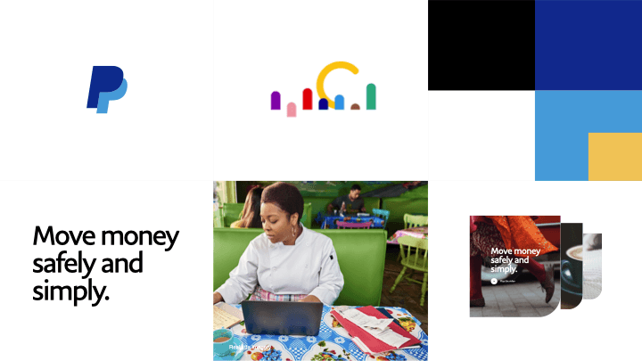
Redesign-of-the-Paypal-Website

Year: 2020 | Duration: 8 months | Team: 4 UX Designers, 1 Design Director, 2 Researchers, 1 PM, 2 Engineers | Tool: Figma, UserTesting, Invision, Keynote
Background
Guide customers to what they need
PayPal aimed to rethink its business and product strategy after identifying that the current website failed to effectively communicate its value proposition and product offerings to users. As a result, business growth was lagging behind other leading fintech competitors.
PayPal asked AKQA to redesign a system-wide update of the logged out website to improve sign up conversion for both consumer and merchants and reach 1 billion user growth.
1.Discover
I don’t know where to start, there is too much communication because website is isolated inconsistent.
As kicked off the project, research team interviewed around 30 users to understand how they react to the current website.
" I wasn't sure which product I was reading sometimes because it is so difficult to find information"
"Making web browser easier to navigate with a list of products would be helpful"
2.Refine
Overcomplicated business ecosystem to lead less product visibility and discoverability
Guided by our UX Lead, I partnered with Senior Designer to conduct a heuristic evaluation of over 200 PayPal web pages and we identified a larger business challenge:
While PayPal had experienced rapid growth through acquisitions and product innovation, it lacked a clear strategy to build a cohesive digital ecosystem that effectively showcased its end-to-end fintech capabilities. Over the years, the site had become increasingly complex and fragmented—made up of disconnected micro-sites that had been built and rebuilt on top of each other, resulting in an inconsistent user experience.
Current PayPal Ecosystem

3.Strategy
How might we become a clear, inspiring gateway to the powerful platform to help the users to achieve their financial goal?
Fragmented and Complex Navigation
Clear, Compelling and Delightful
Decentralized inconsistencies
Values-driven platform and partner
4.Information architecture
Audience Driven or Action Driven?
We started lot of design exploration internally include over 30+ different direction and narrow down to 4 different prototype and test with 40 users including consumer, merchant and developer.
Through user testing result, we learned that customers prefer a user-driven browsing experience over an action driven one.They value personalization—expecting PayPal to recognize their needs and provide tailored recommendations based on where they are in their journey.
Current IA

New IA

5.Design
Craft Clear, Compelling and Delightful
Worked with AKQA Design Lead Daniel to define how to deliver an intuitive and engaging storytelling experience—shifting from static product listings to narrative-driven content that highlights customer success stories, real-world use cases, and personalized recommendations based on different user needs and stages of their journey.

Apply engaging storytelling and product demonstration techniques through new design system
The logged-out experience needs to be radically simplified with a flatter information architecture, clearer content structure, and modernized page design using updated components. The goal is to guide customers directly toward sign-up, minimizing distractions from unnecessary navigation or cross-sell promotions.

6.Outcome
Increase growth through delightful design
We delivered the redesigned experience to PayPal in 2020. The client was very pleased with the intuitive navigation and refreshed brand style. PayPal’s design team built on this work and launched the new site in 2021.
After launch, PayPal saw strong business growth:
14.5 million new active accounts added in 2021
403 million total active accounts, a 21% year-over-year increase
I’m proud to have played a key role in helping improve user engagement, service discoverability, and brand perception.
Year: 2020 | Duration: 8 months | Team: 4 UX Designers, 1 Design Director, 2 Researchers, 1 PM, 2 Engineers | Tool: Figma, UserTesting, Invision, Keynote
Background
Guide customers to what they need
PayPal aimed to rethink its business and product strategy after identifying that the current website failed to effectively communicate its value proposition and product offerings to users. As a result, business growth was lagging behind other leading fintech competitors.
PayPal asked AKQA to redesign a system-wide update of the logged out website to improve sign up conversion for both consumer and merchants and reach 1 billion user growth.
1.Discover
I don’t know where to start, there is too much communication because website is isolated inconsistent.
As kicked off the project, research team interviewed around 30 users to understand how they react to the current website.
" I wasn't sure which product I was reading sometimes because it is so difficult to find information"
"Making web browser easier to navigate with a list of products would be helpful"
2.Refine
Overcomplicated business ecosystem to lead less product visibility and discoverability
Guided by our UX Lead, I partnered with Senior Designer to conduct a heuristic evaluation of over 200 PayPal web pages and we identified a larger business challenge:
While PayPal had experienced rapid growth through acquisitions and product innovation, it lacked a clear strategy to build a cohesive digital ecosystem that effectively showcased its end-to-end fintech capabilities. Over the years, the site had become increasingly complex and fragmented—made up of disconnected micro-sites that had been built and rebuilt on top of each other, resulting in an inconsistent user experience.
Current PayPal Ecosystem
3.Strategy
How might we become a clear, inspiring gateway to the powerful platform to help the users to achieve their financial goal?
Fragmented and Complex Navigation
Clear, Compelling and Delightful
Decentralized inconsistencies
Values-driven platform and partner
4.Information architecture
Audience Driven or Action Driven?
We started lot of design exploration internally include over 30+ different direction and narrow down to 4 different prototype and test with 40 users including consumer, merchant and developer.
Through user testing result, we learned that customers prefer a user-driven browsing experience over an action driven one.They value personalization—expecting PayPal to recognize their needs and provide tailored recommendations based on where they are in their journey.
Current IA
New IA
5.Design
Craft Clear, Compelling and Delightful
Worked with AKQA Design Lead Daniel to define how to deliver an intuitive and engaging storytelling experience—shifting from static product listings to narrative-driven content that highlights customer success stories, real-world use cases, and personalized recommendations based on different user needs and stages of their journey.
Apply engaging storytelling and product demonstration techniques through new design system
The logged-out experience needs to be radically simplified with a flatter information architecture, clearer content structure, and modernized page design using updated components. The goal is to guide customers directly toward sign-up, minimizing distractions from unnecessary navigation or cross-sell promotions.
6.Outcome
Increase growth through delightful design
We delivered the redesigned experience to PayPal in 2020. The client was very pleased with the intuitive navigation and refreshed brand style. PayPal’s design team built on this work and launched the new site in 2021.
After launch, PayPal saw strong business growth:
14.5 million new active accounts added in 2021
403 million total active accounts, a 21% year-over-year increase